
Note: I previously posted this 'article' back in June 2016, but given the recent increased interest in the subject of Color Volume, not to mention the many misconceptions about it, I decided to revisit it again. I also added a lot of additional info, illustrations, and pictures to it.
A TV's color is determined by its "Color Depth", "Color Gamut", and "Dynamic Range".
Color Depth (or "Bit-Depth", e.g. 8-bit, 10-bit, 12-bit) determines how many distinct color variations (tones/shades) can be viewed on a given display.
Color Gamut (e.g. WCG) determines which specific colors can be displayed from a given "Color Space" (Rec.709, Rec.2020, DCI-P3) (i.e. the color range).
Dynamic Range (SDR, HDR) determines the luminosity range of a specific color - from its darkest shade (or tone) to its brightest.
The overall brightness range of a color will be determined by a display's "contrast ratio", that is, the ratio of luminance between the darkest black that can be produced and the brightest white.
Color Volume is the “Color Gamut” + the “Dynamic/Luminosity Range”.
A TV's Color Volume will not only determine which specific colors can be displayed (the color range) but also that color's luminosity range, which will have an affect on its "brightness", and "colorfulness" (intensity and saturation).
Color Depth
Color Depth, also known as bit depth, is either the number of total bits used to indicate the color of a single pixel (bpp), in a bit-mapped image or video frame buffer, or the number of bits used for each of the red, green and blue color components that make up a single pixel.
A TV's Color/Bit Depth determines the total/maximum amount of distinct colors that it can display. This does not mean that the image necessarily uses all of these available colors, but that it can instead specify colors with that level of precision.
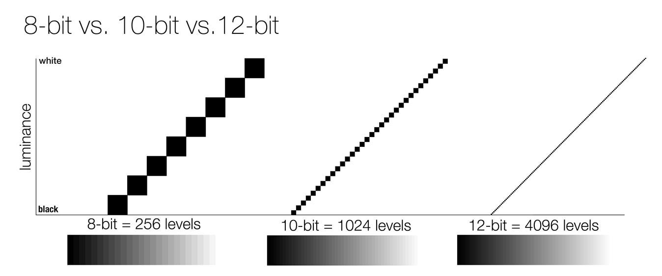
A "Full-Range" 8-bit RGB signal (0-255) refers to the number of color tones/shades (256) that are available in each of the Red, Green, and Blue channels (for a total of 16.78 million possible color variations - ranging from Blacker-than-Black to Whiter-than-White). Note: 8 bits per channel equals 24 bits per pixel (bpp).
For a "Limited-Range" 8-bit RGB signal (16-235), a total 10.65 million color variations will be available. Note: The human eye can discriminate up to ten million distinct colors.
A 10-bit RGB signal has a Full-Range color depth of 0-1023 (1,024 color tones/shades available in each of the Red, Green, and Blue channels for a total of 1.07 billion possible color variations).
For a "Limited-Range" 10-bit RGB signal (64-940), a total 674.53 million color variations will be available.
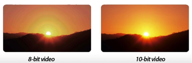
Note: Generally speaking, the broader the dynamic/luminosity range of the display and content, the more "bits" are needed to avoid seeing "color banding" or "posterization" in the displayed image. 'Banding' occurs more easily in regions of gradual color transitions, such as smooth skies, because the human visual system has different sensitivities at different brightness levels and is particularly sensitive to small changes over large areas of nearly uniform brightness.
![Image]()
![Image]()
Now taking it a step further, a 12-bit RGB signal would have a Full-Range color depth of 0-4095 (4,096 distinct color tones available in each of the Red, Green, and Blue channels for a total of 68.72 billion possible color variations).
![Image]()
Note: Standard Dynamic Range (SDR) content is usually encoded with an 8-bit Color Depth, whereas High Dynamic Range (HDR) content is usually encoded with a Color Depth of either 10-bit (e.g. HDR10) or 12-bit (e.g. Dolby Vision).
Color Space
The Color Space, sometimes referred to as the "Color Model" (or "Color System"), is a specific organization and representation of colors.
The Color Model is an abstract mathematical model which simply describes the range of colors and represent them as tuples of numbers or color components (e.g. RGB). The Color Space relates numbers to actual colors. Each color in the system is represented by a single dot.
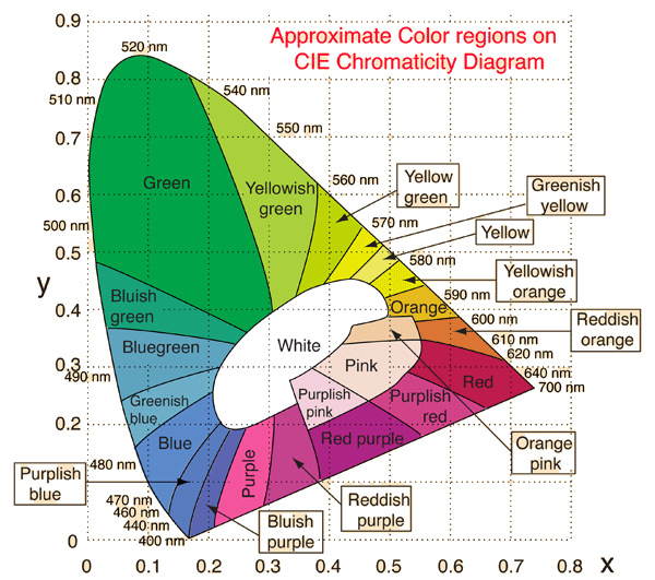
Color Spaces are often represented using two-dimensional slices from their full 3D shape - luminance (brightness) being the third dimension. 'Luminance' is the relative lightness or darkness of a particular color, from black (no brightness) to white (full brightness). These "slices" are useful for everyday purposes because they allow you to quickly see the entire boundary of a given cross-section.
The most saturated vivid colors are located at the outer rim of the region; the least saturated colors are at the center. "Saturation" describes the intensity (purity, strength) of a color's hue (chroma). When a color is fully saturated, it is considered to be in its purest (truest) version.
![Image]()
The tongue-shaped or horseshoe-shaped two-dimensional "CIE 1931 Color Space" diagram represents all of the 'chromaticities' visible to the average human eye at a specifically defined level of luminance and is usually referred to as "the gamut of human vision".
"Chromaticity" is an objective specification of the quality of a color regardless of its luminance. The CIE 1931 colour chart was the first defined standard that showed the link between the three primary colours of red, green and blue and the way that those colours are actually seen by our eyes and thus provided an overall range from which various Colour Spaces could be created.
Note: The "International Commission on Illumination" - also known as CIE from its French title, la "Commission Internationale de l'Éclairage" - is devoted to worldwide cooperation and the exchange of information on all matters relating to the science and art of light and lighting, colour and vision, photobiology and image technology.
![Image]()
Note: It is impossible to accurately depict the gamut/range of human color vision on a computer monitor.
![Image]()
The next diagram [see Spoiler!] shows the chromaticities of "black-body light sources" (white light) of various temperatures, and "lines of constant correlated color temperature" (specific white points).
![Image]()
Tech Note: "White" has no definite position in this diagram; rather it is defined according to the color temperature (measured in "Kelvin") which refers to the color of the light source that's being displayed on your screen. In order for your TV to adhere to the director's vision, it needs to reproduce white as closely as possible to the ISF recommended D65 (Daylight 6500K) which is similar to ambient daylight at midday (on a cloudy day). D65 is the standard used throughout the film and TV world.
![Image]()
TV's use additive color mixing with primary colors of red, green, and blue, each of which stimulates one of the three types of the eye's photo-receptors (color-sensitive cones) with as little stimulation as possible of the other two. This is called an "RGB" Color Space.
An RGB Color Space is represented on the "chromaticity diagram" by a triangle joining the coordinates for the three primary colors. Other colors could, in principle, be used, but with red, green and blue the largest portion of the human vision color space can be captured.
Having a specifically defined Color Space is needed so that images can be accurately and consistently reproduced. Without some form of agreed upon standard how would anyone know what a specific colour was supposed to look like? Without this standard how was a program maker, a broadcaster or a TV manufacturer supposed to know what colours to use? This adherence to colour standards is vital in ensuring that what is being produced, broadcast and displayed is correct and retains the content creator's original intentions.
![Image]()
![Image]()
The Color Space is essentially the "container" that determines the maximum color range a digital device can work in but is "device-independent". It defines all possible or realizable colors which can be made from the color combinations that fall within its boundaries. The larger the Color Space, the more colors a particular device can potentially display and the more saturated those colors can be.
Colors that fall outside the chromaticity triangle are said to be "out-of-gamut".
Color Gamut
The Color Gamut defines the specific range of colors (or subset of colors) that a digital device (e.g. TV, computer monitor) can display/reproduce from within a given device-independent reference Color Space and is expressed as a percentage of that Color Space (e.g. 98% of Rec.709; 95% of DCI-P3; 73% of Rec.2020).
![Image]()
Similar to how an artist might mix their primary colors on a palette in order to visualize the range of colors they have to draw from, the Color Gamut is effectively just a digital palette; except these colors are much more precisely organized and quantified.
Note: "Color Gamut" is often also used to refer to the larger "Color Space" - in which case the two terms are used interchangeably.
The Color Gamut establishes a definite "footprint" within the reference Color Space and is a useful method and tool for users to understand the color capabilities of a particular digital device.
![Image]()
To have an idea of the ability of a display to represent colors that are "true to life", it is important to know how much of a given Color Space their Color Gamut actually covers. Most SDR (Standard Dynamic Range) content uses the more narrow Rec.709 Color Space while most HDR (High Dynamic Range) content uses the much broader Rec.2020 Color Space. [more on "Dynamic Range" later]
Now since most modern displays' Color Gamut usually covered the entire Rec.709 Color Space (or more), there really was no need to differentiate between the two terms because, in this case, Color Gamut did, more or less, equate to Color Space.
However, with Rec.2020, that is no longer the case. No current display's Color Gamut can cover the entire, much wider, new Color Space; not even close. Which is one reason we usually refer to a display's Color Gamut as covering only a certain percentage of a specified Color Space (i.e. P3 or Rec.2020).
Rec.2020 (or BT.2020)
Even though it is usually only referenced when talking about Color Space, and compared to the old Rec.709 and DCI P3 color spaces, it actually specifies and defines more than just the Color Space (as did Rec.709 before it - Rec.709 has been the industry standard for broadcast TV and Blu-ray since the advent of High Definition displays).
Recommendation ITU-R BT.2020-2, which dates back to August 23, 2012 and was revised in October 2015, is a set of standards that defines, in addition to "color space", various other aspects of Ultra HD TV such as display resolution, frame rate, chroma sub-sampling, and bit depth. It is the new standard for UHD displays and players.
The overall standards developed for Rec.2020 were intended to be future proof, so some of them, such as the full Color Space and 8K resolution, are currently unattainable by today's displays.
DCI (Digital Cinema Initiative) P3 is the Color Space currently used by the film industry for Digital Cinema.
That said, UHD HDR movies and shows that are graded for a home release are currently being mastered with a P3 color gamut; however, they are delivered in a BT.2020 "container". Put differently, all UHD HDR content is encoded as BT.2020 for home delivery and every UHD HDR TVs, players, and streaming devices use the Rec.2020 Color Space.
The Ultra HD Alliance (UHDA), specifies that a TV needs to be able to display a minimum of 90% of DCI P3 to receive the "Ultra HD Premium" certification (see "ULTRA HD PREMIUM" Specs).
Dynamic Range
Dynamic Range is - according to Wikipedia - "the ratio between the largest and smallest values that a certain changeable quantity can assume".
When it comes to displays, it refers to its overall brightness range or luminosity range, that is, the ratio of luminance between the darkest black that can be produced and the brightest white (i.e. its "contrast ratio"). 'Brightness' is the relative lightness or darkness of a particular color, from black (no brightness) to white (full brightness).
Note: The presence of any ambient light in a room will significantly impact a TV's perceived contrast ratio.
The human eye is able to easily see objects in both starlight (although "colour differentiation" is greatly reduced at low light levels) and in bright sunlight, even given the fact that on a moonless night objects receive only a very small fraction of the illumination they would on a bright sunny day.
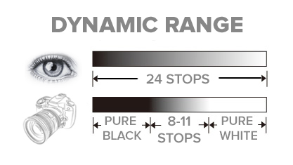
Since it can dynamically adapt to different brightness levels by closing and opening the pupil, the human eye can perceive scenes with a very high dynamic contrast ratio, anywhere from 1,000,000-17,000,000:1 (or 20-24 stops of light), far surpassing the capabilities of a single camera image.
![Image]()
![Image]()
However, our eyes cannot perform these feats of perception at both extremes of the scale at the same time - it takes time for them to adapt and adjust to different brightness levels - their dynamic range in a given scene is actually quite limited. Nonetheless, it is still higher than the "static" brightness range of most display technology.
At any given time, the eye's static contrast ratio is somewhere between 1,000-15,000:1. In situations of extreme low-light viewing (where our eyes have adjusted to use rod cells for "scotopic/night vision"), our visual system can accommodate an even larger brightness range.
If we consider our eye's instantaneous (static) dynamic range - where our pupil opening is unchanged, like looking at one region within a scene, letting our eyes adjust, and not looking anywhere else - most estimate that our eyes can see anywhere from 10-14 stops of dynamic range, which definitely surpasses most compact cameras (5-7 stops), but is surprisingly similar to that of digital SLR cameras (8-11 stops).
A digital or film-based image can only record so much detail between the darkest shadows of a scene and the brightest highlights, and eventually will render tones at the end of this scale as an effective black or white simply because there is not enough detail available (details in the bright and dark parts of the image will be clipped). The ability to produce a wider luminosity range, or to have a greater range of tones available between black and white, is what is sought when comparing the dynamic range of different cameras or displays.
In practice, it is difficult to achieve the full dynamic range experienced by humans using electronic equipment. Electronically reproduced video often uses some trickery to fit original material with a wide dynamic range into a narrower recorded dynamic range that can more easily be stored and reproduced. In other words, the extended luminosity range of a high dynamic range image has to be compressed to fit into a lower dynamic range to be made visible. This method of rendering is called "tone mapping".
Tone mapping is a technique used in image processing to "map" one set of color tones to another in order to approximate the appearance of high dynamic range images in a medium that has a more limited dynamic range. One of the goals of tone mapping is to be able to reproduce a given scene or image onto a display device such that the "brightness sensation" of the image to a human viewer closely matches the real-world "brightness sensation".
Most displays have a limited dynamic range that is often inadequate to reproduce the full range of light intensities present in natural scenes. Tone mapping addresses the problem of strong contrast reduction, from the scene radiance to the displayable range, while preserving the image details and color appearance important to appreciate the original scene. This is often done at the cost of reducing the global contrast of the scene, but the local contrast is maintained and the image as a whole continues to look natural.
When viewing a real-world scene, our eyes can focus on different parts of the scene and dynamically adapt and adjust for the different light levels of those different areas - our pupils open and close for the different brightness regions of the scene, giving them the ability to make out tons of detail in both the dark parts and bright parts of the scene.
Additionally, the human brain has an amazing ability to take-in all those details, intelligently interpreting the information from our eyes, and "create" a single mental picture that takes into account all those details.
High Dynamic Range (HDR)
When the term "dynamic range" is mentioned, most people automatically think of HDR.
Now given the fact that there are already countless articles/posts and dedicated threads on this Forum on the subject of HDR - not to mention an entire section set aside for it HERE - I'm not going to spend much time on it in this article.
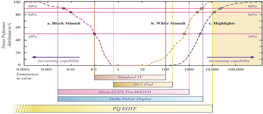
"SDR" (Standard Dynamic Range) movies and TV shows are graded and mastered based on a maximum brightness level of around 100 nits (cd/m²) for the home and around 48 nits for cinema, and a minimum brightness level of 0.1-0.01 nits. [A "nit" is a unit used to measure brightness and is equivalent to a candela per square meter.]
One of the problems with restricting maximum brightness to 100 nits is that the brighter the color, the closer it becomes to white (the brightest color) - so bright colors become less saturated. For example, the brightest saturated blue on an SDR display is a mere 7 nits, so a blue sky will never be as bright or as saturated as it should be.
In contrast, HDR movies are currently being graded and mastered to a maximum brightness level of 1000-4000 nits.
Note: The human visual system can actually detect brightness levels as high as 100,000,000 nits or as low as 0.000001 nits.
With the available maximum brightness of today’s HDR capable displays, a content creator now has the available brightness range needed to represent a sky that is both truly bright and fully saturated, making it seem more natural and much closer to the real-world scene.
![Image]()
Note: The PQ or Perceptual Quantizer (published by the Society of Motion Picture and Television Engineers as SMPTE ST 2084) EOTF (Electro-Optical Transfer Function), that both HDR10 and DolbyVision are based on, actually allows for a peak brightness level of up to 10,000 nits (and minimum brightness levels as low as 0.0001 nits) - think of it as headroom for future expansion [see Spoiler!]. Brighter displays are coming!
![Image]()
![Image]()
Now some of you might be thinking at this point that 4000 nits is already way too bright (never mind 10,000 nits), but consider this: the ambient brightness of a sunny day with clear blue skies is between 7000-10,000 nits (between 3000-7000 nits for overcast skies and indirect sunlight). 10,000 nits is also the typical brightness of a fluorescent tube - bright, but not painful to look at.
The natural world has a much broader range of color and brightness than current broadcast TV, Blu-rays, and Cinema systems support. A bright sunny day can have specular highlights that reach over 100,000 nits. Direct sunlight is around 1,600,000,000 nits.
![Image]()
![Image]()
Also, bear in mind that those maximum nit values usually only apply to "specular highlights" (small areas of the screen) and are only present in some scenes not all - the overall brightness level of the entire movie will still be around 100-120 nits. This means that the APL (Average Picture Level) of an HDR movie will not be significantly different than for an SDR movie. Increasing the available dynamic range simply gives you more headroom to play with.
Note: An HDR image or video does not guarantee a greater dynamic range unless this greater dynamic range is also present in the original content or scene.
Below are a couple of simulated images showing the differences between SDR and HDR.
![Image]()
Here are a few more simulated images that show the differences between HDR and SDR.
![Image]()
![Image]()
Here is a quote [see Spoiler!] from Stephen Nakamura a colorist with "Company 3" in LA, who has worked with really high profile directors and cinematographers and knows more about HDR than most people. He has graded in HDR movies like Exodus: Gods and Kings (the first ever movie to be HDR graded); Tomorrowland (Disney’s first HDR grade and a movie made for the format); The Martian; and Joy.
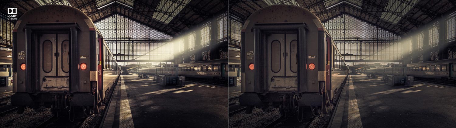
Now, as Stephen Nakamura pointed out, just because an HDR scene can be a lot brighter (with brighter highlights) and more colorful than an SDR scene it doesn't mean that it should be. The important thing for a colorist when grading for HDR is in trying to preserve the 'creative intent' of the director.
As he puts it, "it’s really all about the aesthetics, so when I grade my movies for HDR, I make sure that I keep the same feel that the cinematographer and the director had intended for the movie... it could look the same [as the SDR grade] or maybe just one scene could look different... again you can take advantage of all of [HDR's available brightness and color] or you can take advantage of none of that... it definitely allows you more creative freedom, that’s for sure".
As an example, if you look at the two simulated images below [see Spoiler!] the correct image that is actually preserving the director's 'creative intent' in this case is the one on the left. Even though the image on the right is a lot brighter, with much brighter specular highlights, and much more colorful, it doesn't reflect the "look" the director was aiming for or the "mood" he was trying to achieve for that particular scene. Brighter doesn't always mean better.
![Image]()
In essence, High Dynamic Range is about the potential of brighter whites with more detailed "specular highlights" and deeper blacks with more "shadow detail".
But more importantly, HDR, combined with a Wide Color Gamut (WCG), is about having the ability to reproduce the world around us as accurately, realistically, and detailed as possible on a display.
Color Volume
So what is Color Volume?
The concept of "color" can be divided into two parts: chromaticity and brightness.
For example, the color 'white' is a bright color, while the color 'grey' is considered to be a less bright version of that same 'white'. In other words, the chromaticity of white and grey are the same while their brightness (luminance) differs. As previously mentioned, "brightness" is the relative lightness or darkness of a particular color, from black (no brightness) to white (full brightness).
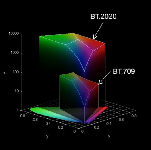
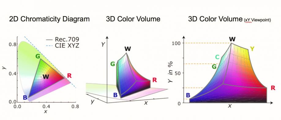
Color Volume includes all colors throughout the entire luminosity range (not just at one specifically defined level of luminance). It is represented by a three-dimensional graph (sometimes referred to as a "3D Color Gamut"). Put simply, the higher the color volume, the better the display can express a vast range of vivid, accurate colors.
“Color Gamut” + “Dynamic/Luminosity Range” = “Color Volume”
![Image]()
![Image]()
![Image]()
The next image below [see Spoiler!] compares the Color Volume of two different TVs. The TV on the left has greater Color Volume than the the one on the right. Note the added brightness and vibrancy in the colors.
![Image]()
Climbing the Staircase
Now coming back to the original premise of my article – that a TV's color is determined by its "Color Depth", "Color Gamut", and "Dynamic/Luminosity Range" (and by extension, its "Color Volume") – I will use an illustration to further explain/illustrate this and show how each component relates to the others.
Now, bearing in mind that no illustration is perfect, I want you to picture a staircase.
Now imagine that the overall height of the staircase represents a color’s luminosity range – from its darkest shade/tone to its brightest. The bottom of staircase would essentially be "true" black, while the top of the staircase would represent "true" white. (Hey! Kinda like a 'Stairway to Heaven')
Now imagine that the overall width of the staircase represents a color’s gamut or range. Each individual "step" of the staircase would represent different brightness levels going from black (or a color’s darkest shade) at the bottom to white (or a color’s brightest tone) at the top.
Tech Note: Even though the overall, maximum width (color gamut/range) of the staircase would remain "fixed" in this case, the width of each individual step (brightness level) in the staircase would vary – narrower at the top and bottom; wider towards the middle (the color gamut, or range of "displayable" colors, will always be broader towards the middle of the brightness range).
Now imagine that the total number of steps in the staircase represents the color depth or bit-depth (the overall number of individual brightness levels/steps in the "grayscale"). The total number of steps (distinct color tones) in this case would be determined by the "bit-depth" (e.g. 256 steps for an 8-bit full-range color depth; 1,024 steps for a 10-bit color depth; and so on).
![Image]()
![Image]()
If you were to increase the overall height (dynamic/luminosity range) of the staircase, with the overall width (color gamut) and the overall number of steps (color/bit depth) staying the same, the actual height of each one of those individual steps would have to increase.
This could potentially lead to each steps being too tall (which could result in "color banding" or "posterization" becoming visible in the displayed image). This is why it is always a good idea to increase the number of "steps" (bits) when increasing the overall "height" (luminosity range) of a staircase.
If you were to increase the overall width (color gamut/range) of the staircase, with the overall height (luminosity range) and the overall number of steps (color depth) staying the same, then the average width (color gamut) of each individual step would, consequently, be increased.
If you were to increase the number of steps (color/bit depth) in the staircase, with the overall height (luminosity range) and the overall width (color gamut) staying the same, then the average height of each one of those individual steps would, consequently, decrease but the overall size (color volume) of the staircase would remain the same.
However, increasing the number of steps (the bit-depth) would reduce the chances of seeing "color banding" or "posterization" in the displayed image (due to the increased number of distinct values available in each of the Red, Green, and Blue channels) - which would result in much smoother color gradients.
Now if you were to increase both the "height" (luminosity range) and the "width" (color gamut) of the staircase, you would in effect be increasing the overall size (color volume) of the staircase, but the number of steps (bit-depth) would remain the same. The number of steps (bits) in the staircase would have no effect on the overall size of the staircase (its color volume).
I hope you have found this article enlightening (pun intended).
Thank you for reading!
Be sure to check out the second part of my article in the next post below.
Also, please feel free to post a comment.
Richard
You can also check out my article "Light and our Perception of Color"
A TV's color is determined by its "Color Depth", "Color Gamut", and "Dynamic Range".
Color Depth (or "Bit-Depth", e.g. 8-bit, 10-bit, 12-bit) determines how many distinct color variations (tones/shades) can be viewed on a given display.
Color Gamut (e.g. WCG) determines which specific colors can be displayed from a given "Color Space" (Rec.709, Rec.2020, DCI-P3) (i.e. the color range).
Dynamic Range (SDR, HDR) determines the luminosity range of a specific color - from its darkest shade (or tone) to its brightest.
The overall brightness range of a color will be determined by a display's "contrast ratio", that is, the ratio of luminance between the darkest black that can be produced and the brightest white.
Color Volume is the “Color Gamut” + the “Dynamic/Luminosity Range”.
A TV's Color Volume will not only determine which specific colors can be displayed (the color range) but also that color's luminosity range, which will have an affect on its "brightness", and "colorfulness" (intensity and saturation).
Color Depth
Color Depth, also known as bit depth, is either the number of total bits used to indicate the color of a single pixel (bpp), in a bit-mapped image or video frame buffer, or the number of bits used for each of the red, green and blue color components that make up a single pixel.
A TV's Color/Bit Depth determines the total/maximum amount of distinct colors that it can display. This does not mean that the image necessarily uses all of these available colors, but that it can instead specify colors with that level of precision.
A "Full-Range" 8-bit RGB signal (0-255) refers to the number of color tones/shades (256) that are available in each of the Red, Green, and Blue channels (for a total of 16.78 million possible color variations - ranging from Blacker-than-Black to Whiter-than-White). Note: 8 bits per channel equals 24 bits per pixel (bpp).
For a "Limited-Range" 8-bit RGB signal (16-235), a total 10.65 million color variations will be available. Note: The human eye can discriminate up to ten million distinct colors.
A 10-bit RGB signal has a Full-Range color depth of 0-1023 (1,024 color tones/shades available in each of the Red, Green, and Blue channels for a total of 1.07 billion possible color variations).
For a "Limited-Range" 10-bit RGB signal (64-940), a total 674.53 million color variations will be available.
Note: Generally speaking, the broader the dynamic/luminosity range of the display and content, the more "bits" are needed to avoid seeing "color banding" or "posterization" in the displayed image. 'Banding' occurs more easily in regions of gradual color transitions, such as smooth skies, because the human visual system has different sensitivities at different brightness levels and is particularly sensitive to small changes over large areas of nearly uniform brightness.
Now taking it a step further, a 12-bit RGB signal would have a Full-Range color depth of 0-4095 (4,096 distinct color tones available in each of the Red, Green, and Blue channels for a total of 68.72 billion possible color variations).
Color Space
The Color Space, sometimes referred to as the "Color Model" (or "Color System"), is a specific organization and representation of colors.
The Color Model is an abstract mathematical model which simply describes the range of colors and represent them as tuples of numbers or color components (e.g. RGB). The Color Space relates numbers to actual colors. Each color in the system is represented by a single dot.
Color Spaces are often represented using two-dimensional slices from their full 3D shape - luminance (brightness) being the third dimension. 'Luminance' is the relative lightness or darkness of a particular color, from black (no brightness) to white (full brightness). These "slices" are useful for everyday purposes because they allow you to quickly see the entire boundary of a given cross-section.
The most saturated vivid colors are located at the outer rim of the region; the least saturated colors are at the center. "Saturation" describes the intensity (purity, strength) of a color's hue (chroma). When a color is fully saturated, it is considered to be in its purest (truest) version.

"Chromaticity" is an objective specification of the quality of a color regardless of its luminance. The CIE 1931 colour chart was the first defined standard that showed the link between the three primary colours of red, green and blue and the way that those colours are actually seen by our eyes and thus provided an overall range from which various Colour Spaces could be created.
Note: The "International Commission on Illumination" - also known as CIE from its French title, la "Commission Internationale de l'Éclairage" - is devoted to worldwide cooperation and the exchange of information on all matters relating to the science and art of light and lighting, colour and vision, photobiology and image technology.
Note: It is impossible to accurately depict the gamut/range of human color vision on a computer monitor.
The next diagram [see Spoiler!] shows the chromaticities of "black-body light sources" (white light) of various temperatures, and "lines of constant correlated color temperature" (specific white points).


TV's use additive color mixing with primary colors of red, green, and blue, each of which stimulates one of the three types of the eye's photo-receptors (color-sensitive cones) with as little stimulation as possible of the other two. This is called an "RGB" Color Space.
An RGB Color Space is represented on the "chromaticity diagram" by a triangle joining the coordinates for the three primary colors. Other colors could, in principle, be used, but with red, green and blue the largest portion of the human vision color space can be captured.
Having a specifically defined Color Space is needed so that images can be accurately and consistently reproduced. Without some form of agreed upon standard how would anyone know what a specific colour was supposed to look like? Without this standard how was a program maker, a broadcaster or a TV manufacturer supposed to know what colours to use? This adherence to colour standards is vital in ensuring that what is being produced, broadcast and displayed is correct and retains the content creator's original intentions.


The Color Space is essentially the "container" that determines the maximum color range a digital device can work in but is "device-independent". It defines all possible or realizable colors which can be made from the color combinations that fall within its boundaries. The larger the Color Space, the more colors a particular device can potentially display and the more saturated those colors can be.
Colors that fall outside the chromaticity triangle are said to be "out-of-gamut".
Color Gamut
The Color Gamut defines the specific range of colors (or subset of colors) that a digital device (e.g. TV, computer monitor) can display/reproduce from within a given device-independent reference Color Space and is expressed as a percentage of that Color Space (e.g. 98% of Rec.709; 95% of DCI-P3; 73% of Rec.2020).

Note: "Color Gamut" is often also used to refer to the larger "Color Space" - in which case the two terms are used interchangeably.
The Color Gamut establishes a definite "footprint" within the reference Color Space and is a useful method and tool for users to understand the color capabilities of a particular digital device.

To have an idea of the ability of a display to represent colors that are "true to life", it is important to know how much of a given Color Space their Color Gamut actually covers. Most SDR (Standard Dynamic Range) content uses the more narrow Rec.709 Color Space while most HDR (High Dynamic Range) content uses the much broader Rec.2020 Color Space. [more on "Dynamic Range" later]
Now since most modern displays' Color Gamut usually covered the entire Rec.709 Color Space (or more), there really was no need to differentiate between the two terms because, in this case, Color Gamut did, more or less, equate to Color Space.
However, with Rec.2020, that is no longer the case. No current display's Color Gamut can cover the entire, much wider, new Color Space; not even close. Which is one reason we usually refer to a display's Color Gamut as covering only a certain percentage of a specified Color Space (i.e. P3 or Rec.2020).
Rec.2020 (or BT.2020)
Even though it is usually only referenced when talking about Color Space, and compared to the old Rec.709 and DCI P3 color spaces, it actually specifies and defines more than just the Color Space (as did Rec.709 before it - Rec.709 has been the industry standard for broadcast TV and Blu-ray since the advent of High Definition displays).
Recommendation ITU-R BT.2020-2, which dates back to August 23, 2012 and was revised in October 2015, is a set of standards that defines, in addition to "color space", various other aspects of Ultra HD TV such as display resolution, frame rate, chroma sub-sampling, and bit depth. It is the new standard for UHD displays and players.
The overall standards developed for Rec.2020 were intended to be future proof, so some of them, such as the full Color Space and 8K resolution, are currently unattainable by today's displays.
DCI (Digital Cinema Initiative) P3 is the Color Space currently used by the film industry for Digital Cinema.
That said, UHD HDR movies and shows that are graded for a home release are currently being mastered with a P3 color gamut; however, they are delivered in a BT.2020 "container". Put differently, all UHD HDR content is encoded as BT.2020 for home delivery and every UHD HDR TVs, players, and streaming devices use the Rec.2020 Color Space.
The Ultra HD Alliance (UHDA), specifies that a TV needs to be able to display a minimum of 90% of DCI P3 to receive the "Ultra HD Premium" certification (see "ULTRA HD PREMIUM" Specs).
Dynamic Range
Dynamic Range is - according to Wikipedia - "the ratio between the largest and smallest values that a certain changeable quantity can assume".
When it comes to displays, it refers to its overall brightness range or luminosity range, that is, the ratio of luminance between the darkest black that can be produced and the brightest white (i.e. its "contrast ratio"). 'Brightness' is the relative lightness or darkness of a particular color, from black (no brightness) to white (full brightness).
Note: The presence of any ambient light in a room will significantly impact a TV's perceived contrast ratio.
The human eye is able to easily see objects in both starlight (although "colour differentiation" is greatly reduced at low light levels) and in bright sunlight, even given the fact that on a moonless night objects receive only a very small fraction of the illumination they would on a bright sunny day.
Since it can dynamically adapt to different brightness levels by closing and opening the pupil, the human eye can perceive scenes with a very high dynamic contrast ratio, anywhere from 1,000,000-17,000,000:1 (or 20-24 stops of light), far surpassing the capabilities of a single camera image.

At any given time, the eye's static contrast ratio is somewhere between 1,000-15,000:1. In situations of extreme low-light viewing (where our eyes have adjusted to use rod cells for "scotopic/night vision"), our visual system can accommodate an even larger brightness range.
If we consider our eye's instantaneous (static) dynamic range - where our pupil opening is unchanged, like looking at one region within a scene, letting our eyes adjust, and not looking anywhere else - most estimate that our eyes can see anywhere from 10-14 stops of dynamic range, which definitely surpasses most compact cameras (5-7 stops), but is surprisingly similar to that of digital SLR cameras (8-11 stops).
A digital or film-based image can only record so much detail between the darkest shadows of a scene and the brightest highlights, and eventually will render tones at the end of this scale as an effective black or white simply because there is not enough detail available (details in the bright and dark parts of the image will be clipped). The ability to produce a wider luminosity range, or to have a greater range of tones available between black and white, is what is sought when comparing the dynamic range of different cameras or displays.

In practice, it is difficult to achieve the full dynamic range experienced by humans using electronic equipment. Electronically reproduced video often uses some trickery to fit original material with a wide dynamic range into a narrower recorded dynamic range that can more easily be stored and reproduced. In other words, the extended luminosity range of a high dynamic range image has to be compressed to fit into a lower dynamic range to be made visible. This method of rendering is called "tone mapping".
Tone mapping is a technique used in image processing to "map" one set of color tones to another in order to approximate the appearance of high dynamic range images in a medium that has a more limited dynamic range. One of the goals of tone mapping is to be able to reproduce a given scene or image onto a display device such that the "brightness sensation" of the image to a human viewer closely matches the real-world "brightness sensation".
Most displays have a limited dynamic range that is often inadequate to reproduce the full range of light intensities present in natural scenes. Tone mapping addresses the problem of strong contrast reduction, from the scene radiance to the displayable range, while preserving the image details and color appearance important to appreciate the original scene. This is often done at the cost of reducing the global contrast of the scene, but the local contrast is maintained and the image as a whole continues to look natural.
When viewing a real-world scene, our eyes can focus on different parts of the scene and dynamically adapt and adjust for the different light levels of those different areas - our pupils open and close for the different brightness regions of the scene, giving them the ability to make out tons of detail in both the dark parts and bright parts of the scene.
Additionally, the human brain has an amazing ability to take-in all those details, intelligently interpreting the information from our eyes, and "create" a single mental picture that takes into account all those details.
High Dynamic Range (HDR)
When the term "dynamic range" is mentioned, most people automatically think of HDR.
Now given the fact that there are already countless articles/posts and dedicated threads on this Forum on the subject of HDR - not to mention an entire section set aside for it HERE - I'm not going to spend much time on it in this article.
"SDR" (Standard Dynamic Range) movies and TV shows are graded and mastered based on a maximum brightness level of around 100 nits (cd/m²) for the home and around 48 nits for cinema, and a minimum brightness level of 0.1-0.01 nits. [A "nit" is a unit used to measure brightness and is equivalent to a candela per square meter.]
One of the problems with restricting maximum brightness to 100 nits is that the brighter the color, the closer it becomes to white (the brightest color) - so bright colors become less saturated. For example, the brightest saturated blue on an SDR display is a mere 7 nits, so a blue sky will never be as bright or as saturated as it should be.
In contrast, HDR movies are currently being graded and mastered to a maximum brightness level of 1000-4000 nits.
Note: The human visual system can actually detect brightness levels as high as 100,000,000 nits or as low as 0.000001 nits.
With the available maximum brightness of today’s HDR capable displays, a content creator now has the available brightness range needed to represent a sky that is both truly bright and fully saturated, making it seem more natural and much closer to the real-world scene.
Note: The PQ or Perceptual Quantizer (published by the Society of Motion Picture and Television Engineers as SMPTE ST 2084) EOTF (Electro-Optical Transfer Function), that both HDR10 and DolbyVision are based on, actually allows for a peak brightness level of up to 10,000 nits (and minimum brightness levels as low as 0.0001 nits) - think of it as headroom for future expansion [see Spoiler!]. Brighter displays are coming!

The natural world has a much broader range of color and brightness than current broadcast TV, Blu-rays, and Cinema systems support. A bright sunny day can have specular highlights that reach over 100,000 nits. Direct sunlight is around 1,600,000,000 nits.


Also, bear in mind that those maximum nit values usually only apply to "specular highlights" (small areas of the screen) and are only present in some scenes not all - the overall brightness level of the entire movie will still be around 100-120 nits. This means that the APL (Average Picture Level) of an HDR movie will not be significantly different than for an SDR movie. Increasing the available dynamic range simply gives you more headroom to play with.
Note: An HDR image or video does not guarantee a greater dynamic range unless this greater dynamic range is also present in the original content or scene.
Below are a couple of simulated images showing the differences between SDR and HDR.

Here are a few more simulated images that show the differences between HDR and SDR.

As he puts it, "it’s really all about the aesthetics, so when I grade my movies for HDR, I make sure that I keep the same feel that the cinematographer and the director had intended for the movie... it could look the same [as the SDR grade] or maybe just one scene could look different... again you can take advantage of all of [HDR's available brightness and color] or you can take advantage of none of that... it definitely allows you more creative freedom, that’s for sure".
As an example, if you look at the two simulated images below [see Spoiler!] the correct image that is actually preserving the director's 'creative intent' in this case is the one on the left. Even though the image on the right is a lot brighter, with much brighter specular highlights, and much more colorful, it doesn't reflect the "look" the director was aiming for or the "mood" he was trying to achieve for that particular scene. Brighter doesn't always mean better.

But more importantly, HDR, combined with a Wide Color Gamut (WCG), is about having the ability to reproduce the world around us as accurately, realistically, and detailed as possible on a display.
Color Volume
So what is Color Volume?
The concept of "color" can be divided into two parts: chromaticity and brightness.
For example, the color 'white' is a bright color, while the color 'grey' is considered to be a less bright version of that same 'white'. In other words, the chromaticity of white and grey are the same while their brightness (luminance) differs. As previously mentioned, "brightness" is the relative lightness or darkness of a particular color, from black (no brightness) to white (full brightness).
Color Volume includes all colors throughout the entire luminosity range (not just at one specifically defined level of luminance). It is represented by a three-dimensional graph (sometimes referred to as a "3D Color Gamut"). Put simply, the higher the color volume, the better the display can express a vast range of vivid, accurate colors.
“Color Gamut” + “Dynamic/Luminosity Range” = “Color Volume”


The next image below [see Spoiler!] compares the Color Volume of two different TVs. The TV on the left has greater Color Volume than the the one on the right. Note the added brightness and vibrancy in the colors.

Now coming back to the original premise of my article – that a TV's color is determined by its "Color Depth", "Color Gamut", and "Dynamic/Luminosity Range" (and by extension, its "Color Volume") – I will use an illustration to further explain/illustrate this and show how each component relates to the others.
Now, bearing in mind that no illustration is perfect, I want you to picture a staircase.
Now imagine that the overall height of the staircase represents a color’s luminosity range – from its darkest shade/tone to its brightest. The bottom of staircase would essentially be "true" black, while the top of the staircase would represent "true" white. (Hey! Kinda like a 'Stairway to Heaven')
Now imagine that the overall width of the staircase represents a color’s gamut or range. Each individual "step" of the staircase would represent different brightness levels going from black (or a color’s darkest shade) at the bottom to white (or a color’s brightest tone) at the top.
Tech Note: Even though the overall, maximum width (color gamut/range) of the staircase would remain "fixed" in this case, the width of each individual step (brightness level) in the staircase would vary – narrower at the top and bottom; wider towards the middle (the color gamut, or range of "displayable" colors, will always be broader towards the middle of the brightness range).
Now imagine that the total number of steps in the staircase represents the color depth or bit-depth (the overall number of individual brightness levels/steps in the "grayscale"). The total number of steps (distinct color tones) in this case would be determined by the "bit-depth" (e.g. 256 steps for an 8-bit full-range color depth; 1,024 steps for a 10-bit color depth; and so on).

This could potentially lead to each steps being too tall (which could result in "color banding" or "posterization" becoming visible in the displayed image). This is why it is always a good idea to increase the number of "steps" (bits) when increasing the overall "height" (luminosity range) of a staircase.
If you were to increase the overall width (color gamut/range) of the staircase, with the overall height (luminosity range) and the overall number of steps (color depth) staying the same, then the average width (color gamut) of each individual step would, consequently, be increased.
If you were to increase the number of steps (color/bit depth) in the staircase, with the overall height (luminosity range) and the overall width (color gamut) staying the same, then the average height of each one of those individual steps would, consequently, decrease but the overall size (color volume) of the staircase would remain the same.
However, increasing the number of steps (the bit-depth) would reduce the chances of seeing "color banding" or "posterization" in the displayed image (due to the increased number of distinct values available in each of the Red, Green, and Blue channels) - which would result in much smoother color gradients.
Now if you were to increase both the "height" (luminosity range) and the "width" (color gamut) of the staircase, you would in effect be increasing the overall size (color volume) of the staircase, but the number of steps (bit-depth) would remain the same. The number of steps (bits) in the staircase would have no effect on the overall size of the staircase (its color volume).
I hope you have found this article enlightening (pun intended).
Thank you for reading!
Be sure to check out the second part of my article in the next post below.
Also, please feel free to post a comment.
Richard
You can also check out my article "Light and our Perception of Color"


")